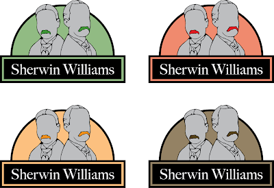
My final logo redesign that I decided on was the Sherwin Williams logo, simply for the fact that when I looked at competitors in the paint field it seemed as if only one company, Behr, had redesign their logo in recent years. Sherwin Williams, along with most of the other paint companies, are still using logos that have not been touched in decades. Also the Sherwin Williams logo that is being used currently is ugly and does not stand up to the companies standards. They claim to be a environment friendly company, but their logo shows a paint bucket covering the globe in paint. Not my idea of a environment friendly company. Also their have such a rich, long history that need to be reflected in the redesign. The original founders, Henry Sherwin and Edward Williams, portraits show this history and I thought it would be a cleaver way to bring this history into the logo.
Below I have posted a few different color-ways of my logo redesign and would like to hear back from everyone to see what colors work or do not work. Also if there is anything else that seems a little off kilter drop me a comment.