
Sunday, May 3, 2009


Monday, April 27, 2009
Web Page
Here is the opening screen for what will be FreshDough.com. I decided to limit the color use, and have most of the screen black. Let me know what you think, would like to have some feed back. Thanks.

Graphic Standards
I want the graphic stands manuel to have the same feel as the rest of my applications, to be clean and professional but also have a hip younger audience draw to it. I found this manual below and like how the colors play a dominate role but also has a non-traditional bind to it, something that works quite well, and would benefit my manual as well.
system application
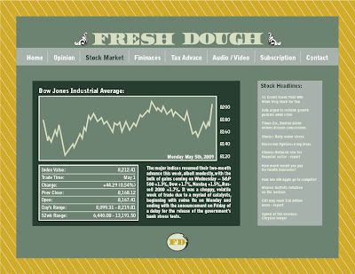
I am planning on doing a mock website for one of the system apps. and I would like it to have the feel of http://www.economist.com/ but with more of a young audience feel to it, much like the menshealth.com website. Along with the mock website, I am planning on doing either a cover to a monthly print magazine that we come with the subscription to Fresh Dough or to do a poster that would be part of the street team handouts. The poster I want to have a impact on the younger crowd, but still carry with it a professional quality. Along with the website, I am going to further the icons that would match up with the icon seen on the handout done for the communication apps. More to come.
Tuesday, April 14, 2009


Subscribe to:
Posts (Atom)