
Sunday, May 3, 2009


Monday, April 27, 2009
Web Page
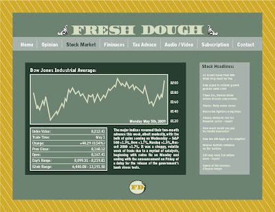
Here is the opening screen for what will be FreshDough.com. I decided to limit the color use, and have most of the screen black. Let me know what you think, would like to have some feed back. Thanks.

Graphic Standards
I want the graphic stands manuel to have the same feel as the rest of my applications, to be clean and professional but also have a hip younger audience draw to it. I found this manual below and like how the colors play a dominate role but also has a non-traditional bind to it, something that works quite well, and would benefit my manual as well.
system application
I am planning on doing a mock website for one of the system apps. and I would like it to have the feel of http://www.economist.com/ but with more of a young audience feel to it, much like the menshealth.com website. Along with the mock website, I am planning on doing either a cover to a monthly print magazine that we come with the subscription to Fresh Dough or to do a poster that would be part of the street team handouts. The poster I want to have a impact on the younger crowd, but still carry with it a professional quality. Along with the website, I am going to further the icons that would match up with the icon seen on the handout done for the communication apps. More to come.
Tuesday, April 14, 2009


Thursday, April 9, 2009
business card
And the business card, it features a hundred on the cover, it creates a buzz when handed out to a future subscriber or interviewee. The back side is fairly basic but once again I used the secondary yellow color, as the background color, used the flourishes that are featured in other places and also the font that is used on other material.


Hand out
Here is the postcard that my street team would be handing out, it introduces what Fresh Dough is all about to the students of Universities. The front side, is to grab the attention of the future young professionals, by letting the know we are here for them as the transition into the next step of their lives. I also place a few images that relate to their future selves, and current college life style. The "FD" logo is going to be printed on transparency and placed between the front and back to create a window. The back copy informs the individual of what exactly we stand for and what we will supply them with. It also has a web link so they can start subscribing to Fresh Dough as soon as possible.


Tuesday, April 7, 2009
Fresh Dough System
I decided that for my system I need to do something different then an letterhead and envelope. Fresh dough is trying to reach students and young adults graduating from college and ready to spend some money and earn some money, and to reach them I would have to have a more hands on approach. A street team would be a great tool to use in order to reach them and to do this I would have to design things for the street team to wear. The t-shirt will act as my envelope or container for carrying information to my intended crowd. Below is a picture of the t-shirt they would wear. Later to come will be an information handout, one that would tell the audience about Fresh Dough, give them information on what we do, link to the webpage or to where they can get the info. and also have a discount code for those would like to subscribe.
Fresh Logo
Coming up on finalizing the logo, got to complete something with it in order to punch through the rest of the project.

Wednesday, March 11, 2009
Information systems continued...


I want to keep the information system clean and neat like above.
This business card if very stunning and would look nice with my symbol as a wax seal:

Inspiration information systems
Here are a couple of information systems found while looking for business cards, letterhead, and envelopes but I also want to do a magazine cover or website.


I like how the colors play the dominant role in these cards:
enjoy the simplicity, but also the boldness of the color:
revision
After critique I have decided that the word mark will be completely eliminated and that the symbol will be the main focus. There is also I need for change of type in the symbol, back to the original, found in older posts, and that the color scheme needs to be moved away from the expected. Also the flourishes needed to be more defined or redone altogether, look for a new symbol on the way.
Tuesday, March 10, 2009

Tuesday, March 3, 2009
working towards the finished product
Here is one of my logos that I have been working on for fresh dough. I have combined several of the key concepts of the previous logos into one logo and hope that it works together. Does the stacked version work with both types of font? I want the logo and the word mark to be able to work separately but am not sure if they work well together. Also if anyone has any ideas on colors that would be greatly appreciated. All the greens except the lime green come from the $1 dollar bill.

Monday, March 2, 2009
Famous Color Palettes
So there are a few websites out there that have tools that grab color palettes from images, or from famous artworks; may be useful if you find an image that you like and want to grab the colors that are more prominent.
www.colorhunter.com
www.colourlovers.com
-this one has a ton of different tools, including one that searches through trends of current magazine issues from a wide range of choices.
Sunday, March 1, 2009

Fresh Dough Logo Sketch
Early stages of logo for Fresh Dough. I decided that I wanted to create a logo that was both engaging for the younger audience which my company is targeting at, and also professional since the material that we are focusing in deals with money managements. I also wanted to bring a new face to money, one that was funky and fun but also smart. It should also have a money feel to it.


Fresh Dough
Ideas for company in personal finance / money management:
I want to create a financial help org. for young college graduates that will introduce them to the ins and outs of all money issues: including taxes, mortgages, loans, debts, ect...
It would also introduces older successful adults to these younger graduates given them tips and tricks in money management.
Fresh Dough Brief:
College was fun, but daddy just cut your monthly check, you just got your first nine to five, now what? Fresh Dough is a company here to help your journey into the real adulthood that your parents warned you about. Mortgage rates, W-2 forms, taxes, salaries, stocks; the world of finances can be quite a scary place for the young and up and coming adults, but where can you turn when The Economist just doesn't make sense?
The main focus of Fresh Dough is to easily and effectively introduce the major financially responsibilities that comes along with obtaining a new career. Buying your first home, filing for taxes or even discussing your first career's starting salary is an important step into getting on the right track in life. Many young adults don;t want to get their information for The Economist and need someone to turn to get information that pertains to their situation. Fresh Dough is that middle ground between not knowing and the bland information of major financial magazines. Our main focus is to reveal the support needed increasing the best financial strategy that fits your needs, by any means.
We introduce young adults to successful, older adults that took the initiative in their own finances and share their secrets. We try to express the importance of understanding your personal finances from the very beginning so that you can be in charge of your own life. With our help, you can guarantee yourself that you will never be playing 'catch-up' on your finances. You will be able to retire younger, build a bigger bank account, and build that dream house. You will also get insight into how the stock market works, what your retirement fund does, and how to get the most out of your early career as possible, in a language that you can comprehend. No more pretending to understand what is really happening with your finances, Fresh Dough is here to set you straight.
Tuesday, February 3, 2009

Wednesday, January 28, 2009
Sherwin Williams Logo Resign
My final logo redesign that I decided on was the Sherwin Williams logo, simply for the fact that when I looked at competitors in the paint field it seemed as if only one company, Behr, had redesign their logo in recent years. Sherwin Williams, along with most of the other paint companies, are still using logos that have not been touched in decades. Also the Sherwin Williams logo that is being used currently is ugly and does not stand up to the companies standards. They claim to be a environment friendly company, but their logo shows a paint bucket covering the globe in paint. Not my idea of a environment friendly company. Also their have such a rich, long history that need to be reflected in the redesign. The original founders, Henry Sherwin and Edward Williams, portraits show this history and I thought it would be a cleaver way to bring this history into the logo.

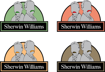
Below I have posted a few different color-ways of my logo redesign and would like to hear back from everyone to see what colors work or do not work. Also if there is anything else that seems a little off kilter drop me a comment.
Sunday, January 25, 2009
Logo Redesign
So the first logo that needs to be redesigned in my mind would be the Sherwin Williams logo. The one thing that really gets to me is the fact that they are trying to be a environment friendly company and their logo shows a paint can covering the globe. They need a logo that reflects their views and does not contradict their values.
The next logo that feels that it needs a little work would be the animal planet logo. This logo was redesigned not too long ago and I feel as though they took a step back. Their old logo featured a elephant and a globe, but the current logo only feature a word mark with the companies logo. Overall the logo needs to reflect the animal kingdom in more then just a textual design.
The last logo is by far one of the worst logos I have seen, the Shamwow logo. Now the company is a informercial based company and their logo does not necessarily need to be of super quality but this logo seems is if it was done in Microsoft word. From their website: "Shamwow washes, dries and polishes any surface. It's like a towel, chamois and sponge all in one! They are made in Germany from a revolutionary fabric that can absorb over 12X its weight in liquid."
Subscribe to:
Posts (Atom)